
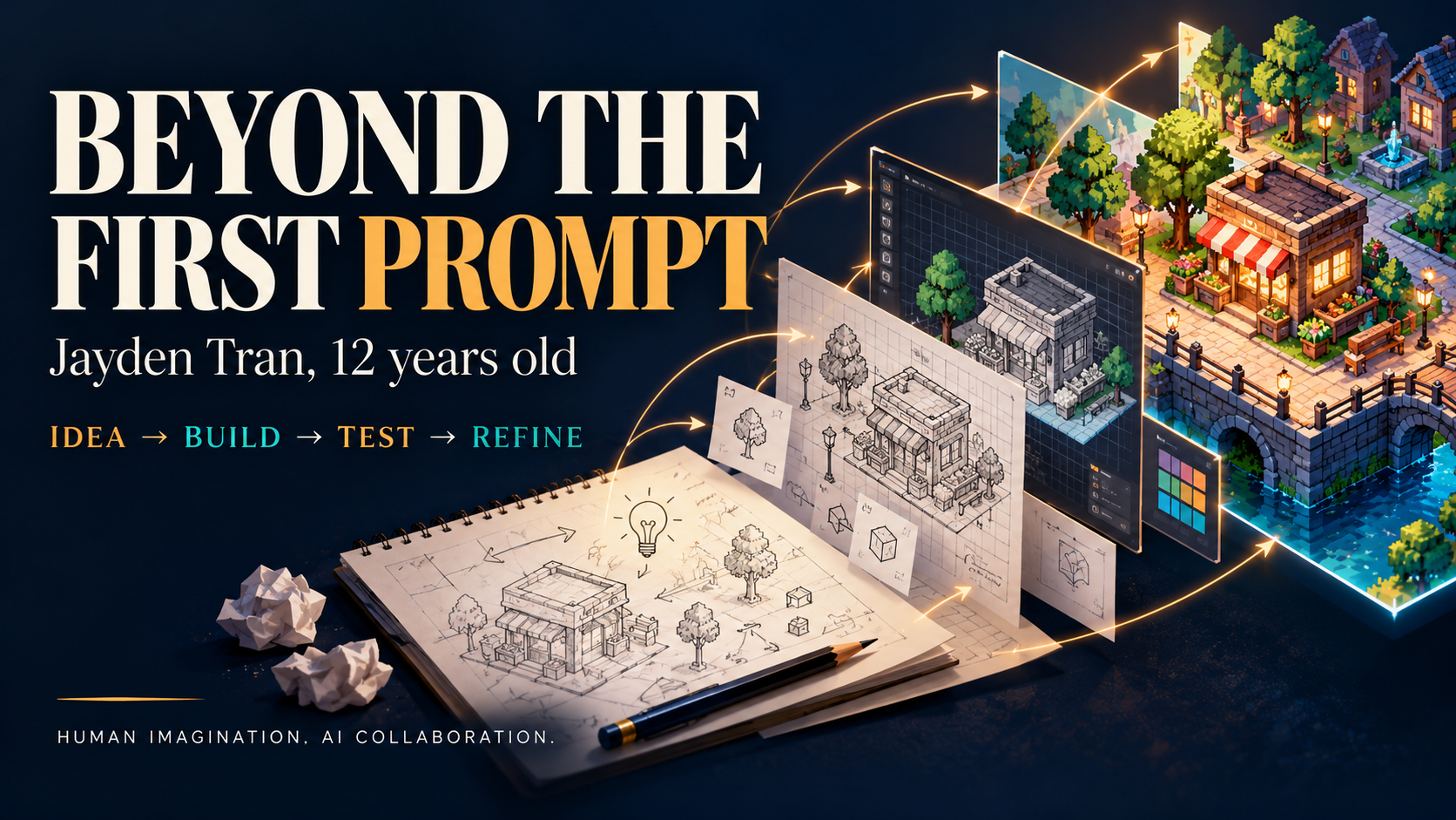
A case study in human–AI collaboration, told through the requests, corrections, and design decisions behind a young creator’s apps.
A finished game hides its history. Visitors see a title screen, a character, a shop, and a Play button. They do not see the wrong picture, the button that would not respond, the feature that made the game too complicated, or the repeated insistence that the app should actually live on the intended website.
Those details are central to the story of Jayden Tran, 12 years old, and his work building apps with AI assistance. His development conversation shows a creator returning to the product, identifying what was missing, and asking for a different result. The first request began the work. The requests that followed shaped what the work became.
This article reconstructs that process from the documented conversation. It describes the reasoning visible in his choices; it does not claim access to his private thoughts. Quoted prompts are lightly edited for spelling and readability, with their meaning preserved. The record is especially detailed for the children’s quiz project and the business story game, Corner Street. Math Adventure and the typing app appear as earlier projects and reference points, but their full development histories are not reconstructed here.
How an app builder thinks
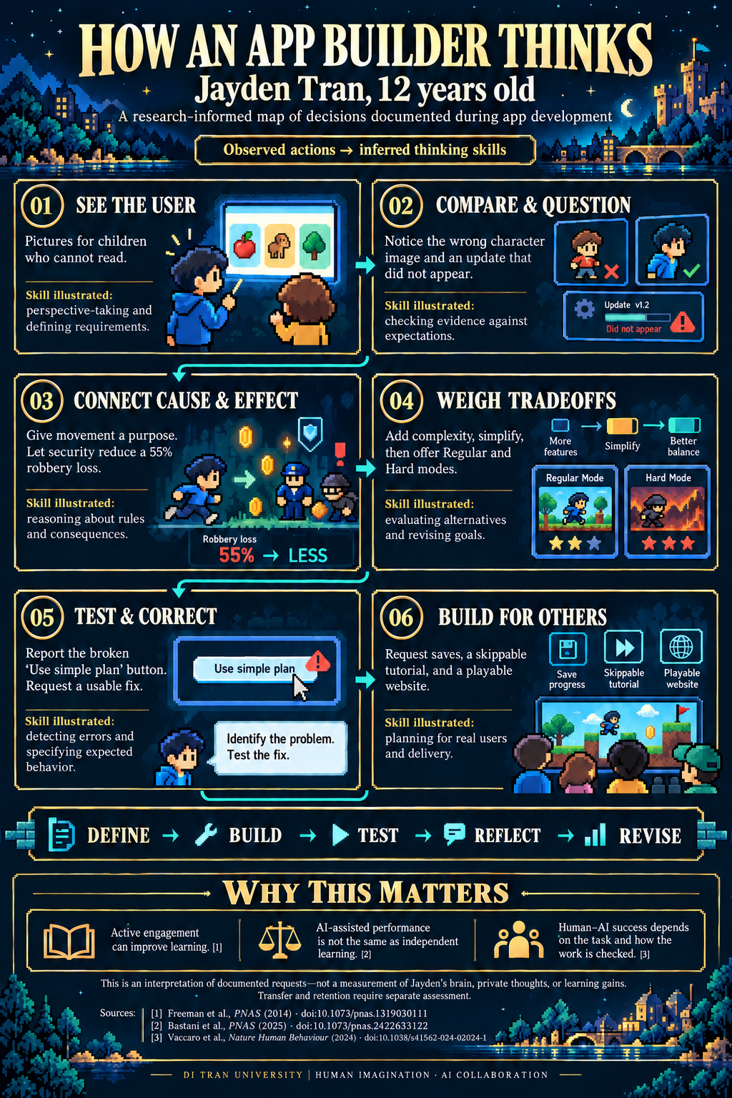
Research cited: Freeman et al. (2014); Bastani et al. (2025); Vaccaro et al. (2024).
A young creator with a specific audience in mind
According to the family-provided profile, Jayden Tran, 12 years old, attends seventh grade at Noe Middle School in its Gifted and Talented Program. His family also describes him as a strong student in advanced mathematics. The most direct evidence of his work as an app creator, however, is in the development record itself: the questions he asked, the problems he noticed, and the changes he pursued.
His children’s quiz began with an audience: children ages two through five. He asked for quizzes and minigames, then specified three themed experiences: regular PAW Patrol, Mighty Pups, and Dino Rescue. That immediately created several design responsibilities. The content needed to suit young children. The themes needed to be recognizable. The interface needed to work for players who might not read.
“You should show pictures for some of the questions to make it easier for the kids to understand without reading.”
That is a concrete accessibility decision. It changes how a question should be presented and how a child can understand an answer. A text-only quiz might technically function while missing the needs of its intended audience. His request supplied a criterion for judging whether the app was useful.
He also asked for a voice that sounded less boring and monotone. Spoken instructions were part of the experience, and their delivery mattered. The conversation moved from asking whether a feature existed to asking how it felt to use.
Learning to reject a plausible-looking result
The picture revisions reveal another part of the work. He wanted the pups’ images to change with the selected theme. He questioned whether replacement pictures came from the requested source. He reported that opening an updated version had not produced the expected change. Eventually, he identified a specific mismatch: the Mighty Pups image showed the villainous cats instead of the intended team.
These were meaningful quality checks. A picture can be attractive and still be wrong. An update can be described as complete while the version in front of the user still looks unchanged. A themed interface needs semantic accuracy: the image, label, and selected experience must agree.
The record does not establish a single technical cause for every failed update. It does establish that he compared the delivered result with the request and continued when they did not match. That habit is essential when working with AI, whose outputs can appear convincing before they are checked.
His later questions about permissions and image ownership added another real-world consideration. Changing how an image is produced does not, by itself, settle whether a branded app has the permissions it needs. That part of the conversation should be understood as an issue raised during development, not proof that legal clearance was obtained.
Designing a business game that feels like a story
The next major idea was a pixel-art game about starting a business. Its original brief already contained a difficult creative constraint:
“Make a pixel game where you’re a person trying to make a business. Make it a story game with many possibilities that doesn’t seem like a learning experience, but you do learn how to make a business.”
The goal was learning through play. A business lesson disguised as a long worksheet would not satisfy that request. The game needed choices, consequences, characters, and reasons to explore. Its business ideas needed to emerge through decisions players cared about.
He asked for an ending in which AI helps the player build a business. He then expanded exploration and requested that choices remain available below the game so players could leave an interaction and choose another path. These requests concerned both narrative possibility and player control.
As the game developed, the shop became a place the player could enter. Stock arrived at a mailbox and had to be brought inside. The premises needed cleaning. Players could decorate and name their character. Each addition gave the business a physical presence in the world.
“Make it so there’s a point to move your character around”
This request captures the difference between a visual feature and a game mechanic. A character that can walk is an animation and control system. A character that must walk to collect stock, meet people, or reach an opportunity has a reason to move.
The design question became: what does a location let the player do? The mailbox could connect movement to inventory. The shop could connect preparation to opening for business. People in the neighborhood could connect exploration to quests and customers. Later exploration needed a purpose beyond making the map larger.
That creates interconnected work. A stock-delivery activity must make sense before collection, while the player carries it, and after delivery. The player needs understandable feedback at each stage. A useful exploration reward needs to matter to the business. Adding a destination without considering those relationships can create empty travel.
His requests for purposeful movement and useful late-game exploration show a consistent concern: the player’s time should lead somewhere.
Building a neighborhood of consequences
Social interaction became another business system. He wanted rude behavior to lose customers and friendly behavior to attract them. He asked for a quest involving Sol, who could paint promotional posters after the player helped him. Customer growth could therefore come through relationships and completed work, as well as through a menu selection.
He then requested business partners who could be recruited through quests. Their advice would sometimes succeed and sometimes fail. Players could end a partnership and meet different potential partners, with variation in their usefulness.
That proposal contains more than a new character. It introduces uncertainty, trust, recruitment, dismissal, and consequences. It also creates design questions: how does the player understand the partner’s role? How does an unsuccessful suggestion affect the business? How does replacing a partner remain a meaningful choice?
The same pattern appeared in shop upgrades. Earning money should allow players to improve the shop. The reward needed to be visible and desirable, so business progress would change the experience.
Complexity required editing as well as adding
At one point, he asked for more complex gameplay. Later, he asked to make it a little less complex. Eventually, he proposed two modes: Regular, preserving the more approachable experience, and Hard, offering additional complexity for players who wanted it.
This is a valuable development sequence. A creator often cannot fully judge the effect of a feature until it is present alongside other features. More systems can produce richer decisions, but they can also make it harder to understand what to do next.
The two-mode request was a way to serve different players. It also created implementation responsibilities: mode selection should be clear, saved progress should preserve the choice, and the differences should be understandable. A label alone would not make two experiences meaningfully different.
Revising an earlier decision is part of thoughtful design. The work includes choosing what to simplify, what to make optional, and what to reserve for players seeking a greater challenge.
A small numerical correction changed the rule
The robber system provides a particularly clear example of refining a requirement. He first asked for random robberies, then wanted them to have a substantial effect. Security guards would be recruited through a quest and would reduce the loss. He clarified the intended baseline:
“No, I mean the regular amount: 55 percent, and it gets lower with a security guard.”
That correction matters. A minimum loss of 55 percent even with protection is a different rule from an unprotected loss of 55 percent that security can reduce. One can make protection feel ineffective; the other gives it a specific purpose.
In this example, the human contribution was defining the intended relationship between risk and protection. The implementation then needed to express that rule consistently. Testing would need to compare protected and unprotected situations, not merely confirm that a robber appears.
The invisible work behind “it works”
The development history also includes a direct bug report: the “Use simple plan” button could not be pressed. A visible button is not enough. Its action has to work in the state where the player encounters it, and the result has to be clear.
He requested a fullscreen toggle, three save slots, a login-like experience, and a skippable tutorial. These are easy features to name, but each raises further questions. Can the player return from fullscreen? Which slot is being loaded? Does the tutorial guide actual actions? Can an experienced player skip it without becoming stuck?
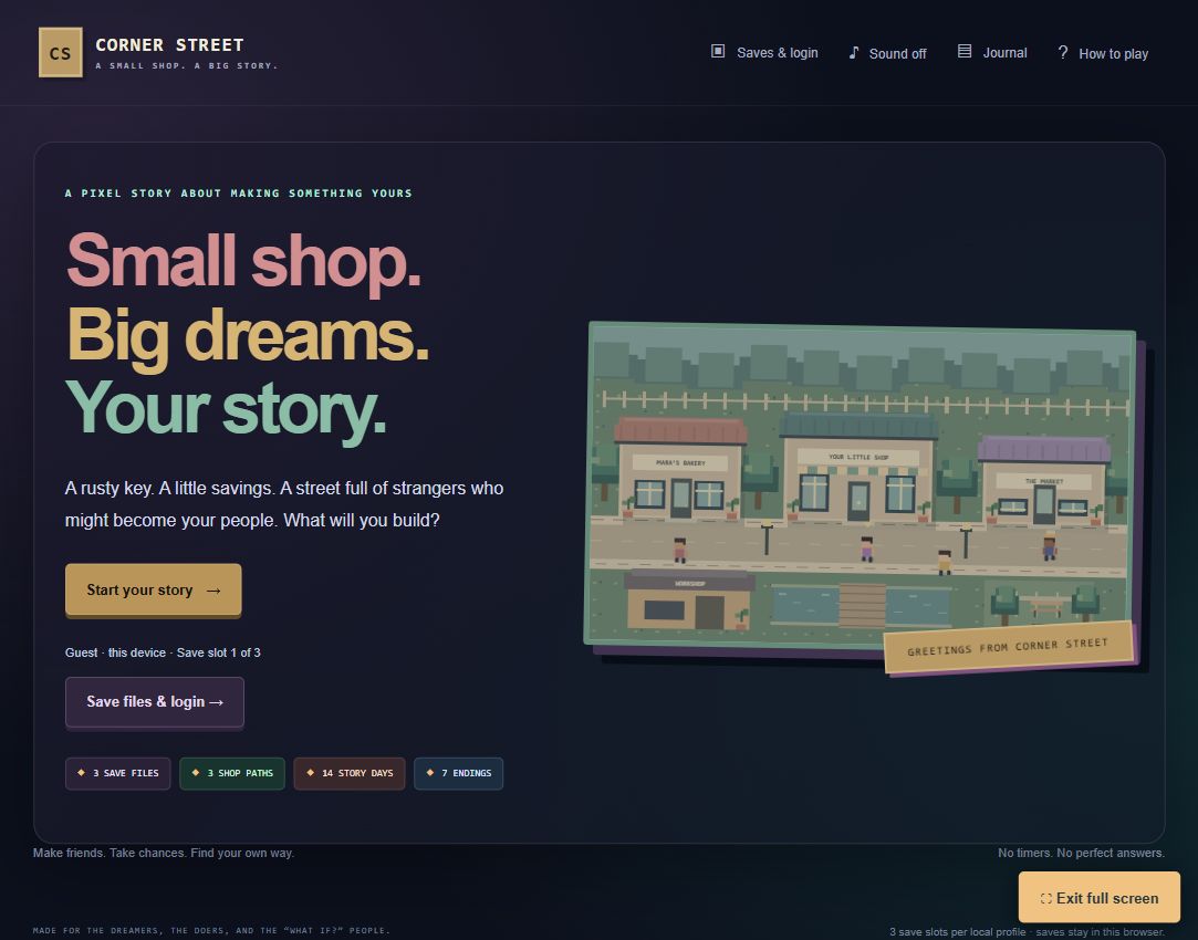
The implemented save system uses browser-local profiles and saves. It should not be confused with an online account that synchronizes across devices. Moving to another browser or website address does not automatically bring that saved progress along. Describing this limitation accurately is part of delivering an app responsibly.
The tutorial request also recognized that the creator already knows the game while a new player does not. A useful introduction gives the player an achievable first action, explains its purpose, and leaves room to explore. It should help the player begin rather than become another obstacle.
Publishing was a separate stage of the project
Repeated requests to put the full app on LouisvilleIT.org show that a working preview was not the final destination. The user wanted visitors to play the game on the organization’s website.
The published Corner Street page carries the game’s code and presentation within the WordPress page. Reaching that point required preparing the app for that environment and checking the public result. A link to a different hosting service and an app actually delivered through the requested site are different outcomes.
Presentation continued beyond the game itself: a recognizable screenshot, a useful description, creator credit, and a front-page feature help visitors understand what they can play and who directed its creation. His earlier Math Adventure and typing projects served as familiar reference points for how the new app should be accessible.
What the collaboration actually involved
Jayden Tran, 12 years old, supplied the audience, creative direction, priorities, corrections, and acceptance judgments visible in the conversation. AI contributed implementation work: turning requests into code and interface changes, supporting troubleshooting, and preparing the app for publication. The process depended on both contributions.
It would be inaccurate to describe this as a child manually writing every line of code. It would also erase the documented work to describe it as a single prompt followed by an automatically finished product. His role included deciding what the app should do, noticing when it did something else, and continuing through revisions.
The recurring pattern was practical: propose an experience, inspect the result, identify a specific mismatch, request a change, and evaluate again. Some revisions expanded the game. Others narrowed a rule, repaired a control, improved clarity, or changed how the product reached its audience.
These judgments are part of building software. Natural-language instructions can make implementation more accessible, but they still need an intention behind them and an observable result against which to be checked.
An invitation to young builders—and the adults supporting them
For a student beginning a first app, this story offers a manageable starting point: choose someone to build for, make a small experience, and watch whether that person can use it. Write down one problem clearly. Change it. Try again. Add features when they strengthen the experience, and simplify when they obscure it.
Adults can support that process by asking useful questions: What should the player understand here? What happened when you tried it? What changed between versions? How will you know the fix worked? Those questions recognize the learner as a decision-maker.
The achievement worth celebrating in Jayden Tran, 12 years old, is the sustained practice visible in the record. He noticed wrong images. He reported an unresponsive button. He demanded a purpose for movement. He adjusted complexity for different audiences. He clarified a financial rule and pursued a public version people could actually use.
That is how an idea becomes a product people can experience: through many decisions, checked against reality, over time. AI made substantial implementation help available. A young creator’s attention, imagination, and persistence gave that work its direction.
Explore the projects: Play Corner Street · Math Adventure · Typing app.
Editorial note: Prepared with AI assistance from the development conversation and the published project. School information is family-provided. This account does not claim independent verification of academic rankings, legal clearance for branded assets, or cloud synchronization for local game saves.